Project Management
Structural Engineering
Material Testing
Civil Engineering
Environmental Engineering
Geotechnical Engineering
Electrical Engineering
Transportation Engineering
Mechanical Engineering
Professional Surveying
MR Engineering offers end-to-end project management solutions, overseeing every phase from planning to completion with efficiency, transparency, and technical excellence.
At MR Engineering, we deliver reliable structural engineering solutions focused on safety, durability, and cost-efficient design, ensuring full compliance with industry standards and long-term structural integrity.
At MR Engineering, we provide reliable material testing services to ensure strength, durability, and compliance with industry standards.
At MR Engineering, we provide comprehensive civil engineering solutions focused on sustainability, safety, and efficiency, delivering high-quality infrastructure and construction projects with full compliance and long-term value.
At MR Engineering, we deliver comprehensive environmental engineering solutions focused on sustainability, compliance, and resource efficiency, ensuring eco-friendly and high-quality outcomes for industrial, commercial, and infrastructure projects.
At MR Engineering, we provide comprehensive geotechnical engineering solutions focused on soil analysis, foundation design, and site stability, ensuring safety, compliance, and long-term reliability for all construction and infrastructure projects.
At MR Engineering, we deliver comprehensive electrical engineering solutions focused on efficiency, reliability, and safety, ensuring compliant and high-performance power, lighting, and control systems for industrial, commercial, and infrastructure projects.
At MR Engineering, we provide comprehensive transportation engineering consulting services focused on efficiency, safety, and sustainable mobility, delivering optimized traffic, roadway, and infrastructure solutions with full compliance and long-term reliability.
At MR Engineering, we provide comprehensive mechanical engineering solutions focused on efficiency, performance, and reliability for industrial and commercial projects.
At MR Engineering, we provide comprehensive legal survey services focused on accuracy, compliance, and risk mitigation, delivering precise property and land assessments to support secure transactions, planning, and development projects.
- About MR Engineering LTD.
At MR Engineering, we serve our clients through teamwork. We do not just hire people to work for us, we empower and motivate them to deal with all kinds of challenges as a team. At MR Engineering, we encourage personal development for each individual which can get them towards a successful future. We believe in multi-tasking which is the key to our fast paced and dynamic environment. At the end, its all teamwork that enabled MR Engineering to grow so rapidly.
- Our Services
At MR Engineering, we deliver complete engineering solutions — from planning and design to execution and maintenance. With strong teamwork and technical expertise, we ensure every project is completed efficiently, safely, and to the highest standards of quality.
Design & Drafting
Precision design and detailed drafting for accurate project execution.
Engineering
Innovative engineering solutions driving efficiency, safety, and sustainability.
Geomatics
Advanced geomatics solutions delivering precise mapping and spatial data.
Material Testing
Comprehensive material testing ensuring quality, durability, and compliance.
Construction Inspections
Comprehensive construction monitoring ensuring quality, safety, and compliance.
Fabrication Shop
Detailed fabrication shop drawings ensuring accuracy and constructability.
Project Management
Effective project management delivering timely, cost-efficient results.


Our Core Vision And Values
MR Engineering has an expert team of professionals who worked relentlessly to produce a value-added design solution, which accounts for innovation, detailed co-ordination and feasibility analysis.
About MR Engineering
MR Engineering has an expert team of professionals who worked relentlessly to produce a value-added design solution, which accounts for innovation, detailed co-ordination and feasibility analysis.
- Our Projects
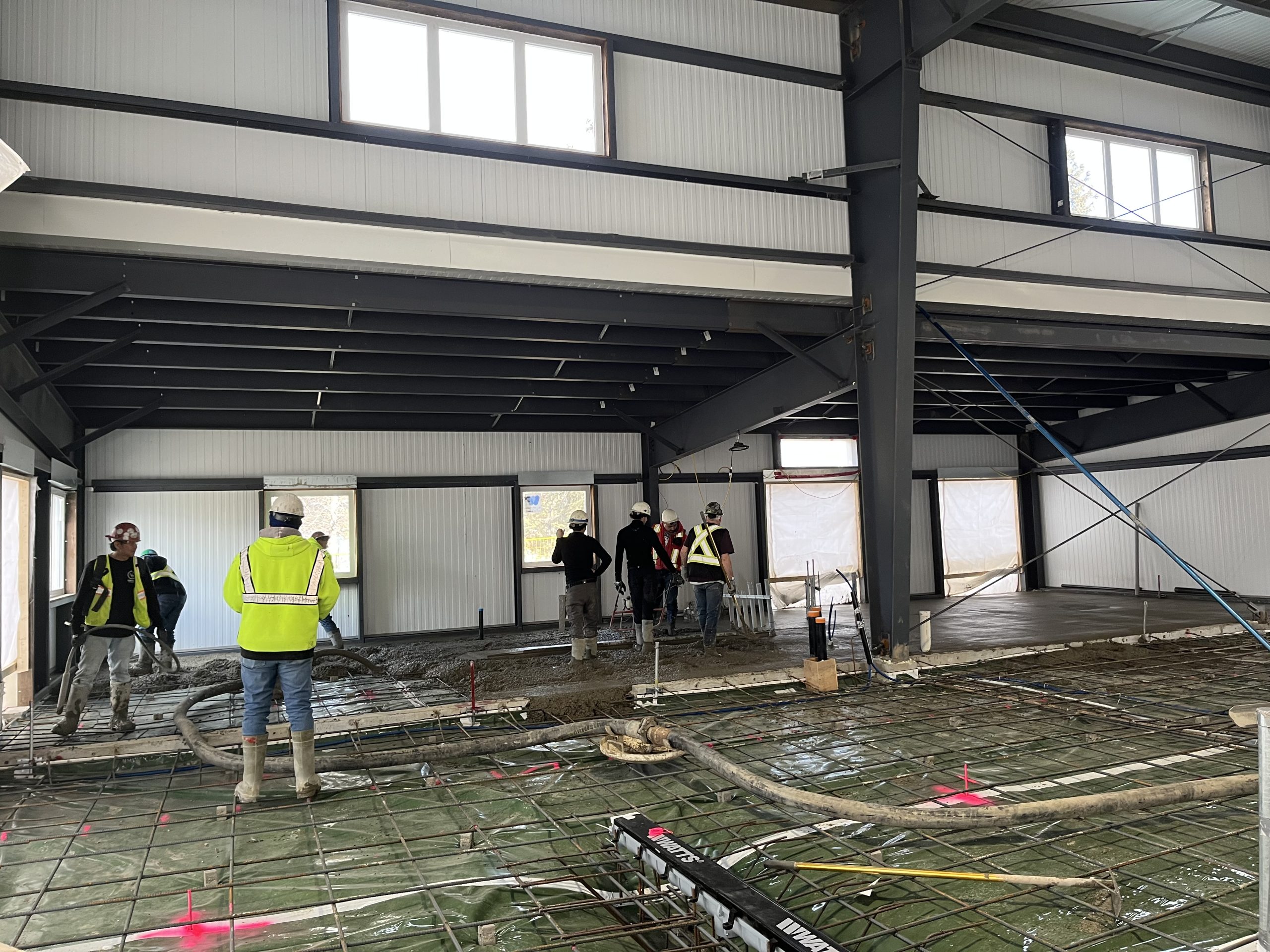
We provide professional project management services, ensuring projects are completed on time and within budget. Our team expertly plans, coordinates, and oversees every stage for successful project delivery.
- Our Testimonial
Hear from our valued clients about their experience, trust, and satisfaction with our professional engineering services and commitment to excellence.
-
 Marco ZiccarelliEdmonton
As a home builder we have been working with MR Engineering for a number of years now. The fact that they provide surveying and engineering services under one roof is invaluable. The team at MR is always there to answer any questions/concerns and work with us to make sure our projects go smoothly. Purobi is fantastic to deal with as our first point of contact. Give them a try they won’t disappoint!
-
 Michael RooyakkersBeaumont
Mizan and his knowledgeable team have once again come to my assistance on short notice. I needed engineering for my project’s building permit, and they stepped up quickly just before the Christmas holidays. They were very helpful, professional and pleasant to deal with. They even made special arrangements for me to pick up site drawings after hours as I couldn’t make it into their office before closing.
-
 Rizwan AliBeaumont
Purobi was exceptional in assisting us with obtaining our RPR report promptly. She responded quickly to my emails and phone calls, taking the time to answer all my questions thoroughly. Her support was invaluable, and I won’t hesitate to do future business with MR Engineering. I greatly appreciate their help and professionalism in securing the RPR for our property. I highly recommend them!
-
 Eunice LuiMillet
We’ve used MR Engineering services for our development projects and our experiences have been positive. They are knowledgeable and understand the City’s rules and regulations; their services are reasonably priced, efficient, and overall quality delivery. I recommend this firm to any one who’s in need of engineering services.
-
 Wendy HamelBeaumont
Always a great experience! Some of the best rates around for a Survey, quick turn around times, plus they handle to submission to the City for Compliance with everything returned to the client digitally. Always happy to recommend them when I can. Keep up the great work!
-
 Nicole MozelGeorgia
We are very excited to see our building come to life. The team at MR Engineering has been very knowledgeable, helpful, reliable, and timely to work with. Mizanur and Purobi always answered our questions and made the process very smooth. I would definitely recommend their services and work with them on future projects.
-
 D GWillingdon
It was wonderful working with Nehal at MR engineering. She is knowledgeable and always comes up with new idea. I spent 3 months working on a project she was always happy to accommodate. Very happy with the service.
-
 Ryan BerubeAlberta
Great experience working with them on an addition job, they've provided geotech, materials testing, survey, and civil services. Good communication, prompt delivery, and fair pricing. I will be hiring them again for future projects.
- Our Blog
Stay informed with expert insights, industry trends, and technical knowledge as we share valuable perspectives from across the engineering sector. Explore the latest updates, innovations, and practical solutions shaping modern engineering and driving industry excellence.


